Think of me not just as a photographer or a designer but as a storyteller and a visionary. With half a decade under my belt, I've proudly woven the narratives for prominent names like Texas A&M Athletics, Texas A&M University Architect, Texas A&M Office of Sustainability, Texas A&M Mays Business School, Texas A&M AgriLife, Texas A&M Engineering, Florida State - London, and several other Texan businesses.
I'm currently refining my expertise with a Masters in Graphical Information Technology at Arizona State University's esteemed College of Engineering. My roots in architectural design gave me an eye for structure and symmetry, which naturally segued into the vibrant world of graphic design. Somewhere along this journey, my lens captured emotions, moments, and stories, both in film and digital, making photography my true calling. Delving deep into the nuances of light and the profound emotions they elicit in spaces, I’ve innovatively infused these elements into my work.
As my reputation as a photographer burgeoned, so did the distinctiveness of my style – a style that captures the soul of the subject.
In addition to my expertise in photography, videography and graphic design, I possess a keen understanding of UX/UI Visual Design. My proficiency in this area allows me to create compelling and user-friendly digital experiences. I leverage my background in architectural design to craft visually appealing and intuitive interfaces that not only captivate audiences but also enhance usability. With a focus on marrying aesthetic appeal with functionality, I strive to design interfaces that tell stories, evoke emotions, and deliver seamless interactions. My dedication to the art of visual design is reflected in my commitment to staying at the forefront of industry trends and best practices.
Driven by a deep-seated desire to serve, a trait nurtured during my time in law enforcement, I am on a mission: to illuminate the creative realm and make a difference, one snapshot at a time.
Let's craft your story together, cheers!
7. Ducks Unlimited Student Campaign
8. Ducks Unlimited Student Feature
Publication Work
While working for Mays Business School I have had the opportunity to use my photography and design skill sets for the publications needed for the college.
The idea was to use Shrihari (Hari) Sridhar a Professor of Marketing as the cover photo to showcase his talents, contribution, and passion that brought him to Texas A&M. The rug used was regional to where Hari is from in India. The background color was chosen for the fun and energy Hari brings with him. The details all provide a glimpse into who Hari is, who he truly is. (Click image to read more)
The publication of Benefactor posed a challenge all while in the middle of a pandemic. I was tasked to present Kyle Gammenthaler and his work for Mays, Texas A&M and the Brazos Valley. The challenge was how to show all of those and be socially distance. (Click image to read more)
The Business Education Complex booklet was a push with the development team to provide donors with an inside perspective as to what was to come, even during a pandemic. Using my architectural knowledge and photography skills I designed and layout the booklet that has helped raise money for Mays. (Click image to read more)
Dr Benjamin was a legend among the accounting community and in education. I knew working to show is a real person, not a number machine, was a challenge. In learning about Dr. Benjamin, he has a passion for race horses. He loves to raise and train them. This is where he lit up to show his true self.
First-Gen Leaders was the first time I used my photography composite skills to the test. I had to provide a single photo of all the First-Gen leaders of Mays. This was a huge challenge for getting all their schedules to align was nearly impossible. This is where I used a trick in photography to photograph each one individually and composite them together. The result was highly praised by Dean Jones and all the other deans. So much they decided to use it in an advertisement in Texas Aggie Magazine.
This shot was showing a deeper glimpse into Hari’s personality. Stylizing the image to reveal his story. Hari wanted to become a professional cricket player and was also a HUGE fan of Robin Williams. So tying in all these facets of Hari was crucial in all my work.
Student Organization in partnership with Ducks Unlimited requested portraits of their leadership for an upcoming article.
Feature photo of Student President of Ducks Unlimited for article.
Print Media Design
Through my career in design I have worked with many people to promote their brand through my design philosophy. I have many years working in print from t-shirt print shop to publications for Mays Business School. I am very knowledgeable of print methods to CMYK to offset printing. I even worked with a plate printer. There I learned about type setting from the old print presses.
I was asked to work with an ALPFA, a national student organization, to help promote an event for them. They invited Maria Elena Salinas to speak about their voice in the future. So, knowing this was a very powerful topic the visual needed to be bold and represent Maria well. I went with a very loud color to represent the voice needed to be heard and the darkness being the silence before. Maria praised the work and even autographed it so the students could keep it as memento.
While working for The Office of Sustainability, I helped develop a look for the Sustainability Highlight report. Worked to take all the data and make it easily digestible for all to read. The photography of the cover was my own work. I worked to align with brand at the time best as possible with so much content needed to be used.
Professor Karen Farmer was invited to a conference to showcase her teaching methods and philosophy. There was opportunity for future grants from this, so I assisted Prof Farmer in developing a look that would give the readers something interesting to read and follow along. High visibility color was key to force the eye to see the poster among others in the conference. This poster was 12’ wide, so this was a huge a print project.
Women’s Leadership Initiative Conference is a yearly event. This event did not have a mark nor a brand color to help build the brand and the content they would share. Colors were complementary to maroon for the ability to stay in brand but still make for its own brand. The overall approach was to show how women as moving in the business world. Motion in the color by way of the gradients. So, power and movement were my main focus, and the mark will be explained shortly.
First Gen pin delivery card was the method in which Mays Business School delivered the pins. The fold was off set to allow the pin to be seen when the card is closed but upon opening the process of how the mark for the pin was created. Presenting Dean Jones as the face of First Gen, being a first gen and the dean was crucial to the development of this piece.
MBA Tailgate was a fun task to highlight the tailgate for donors. This allowed me to use all my techniques and experience from working Texas A&M Men’s Basketball as their creative content creator.
Texas A&M AgriLife holiday box design is a yearly project that allows for a festive holiday theme to package together items that are associated with Texas A&M AgriLife Research or people.
The holiday card is included with the box to provide a message thats from the dean and vice-chancellor of Texas A&M AgriLife.
A strategy into the design of allowing for some motion elements to be included in the look and feel of the media to provide some layers to the static image for social media.
AgriLife Learn concept was an initiative to develop a look that allowed for a theme to be carried over into a state-wide program.
3. Educational Teaching Visual Design
4. Women’s Leadership Conference
7. AgriLife Holiday Box
9. Social Media Design Strategy
1. Leon Contreras Photography
7. BBQ Genius
Logo Design
Logo Design has been a welcome challenge.
Leon Contreras Photography logo is my personal brand logo.
First Gen Mark was an idea from Dean Jones to highlight a recognize first gen students at Mays. After Dean Jones promoted the pin, the provost office wanted to use the mark and pins as well. We supplied them with 700 pins from the first shipment. The mark is a simple cap and mortarboard that is a traditional symbol for graduation in education in the US. The number 1 is used to represent the tassel. I used the negative space to show the number one as the tassel. This in an isometric orientation allows for the cap and mortarboard to be seen and the tassel number one as well.
The Women’s Leadership Initiative mark was inspired from the Wonder Woman Logo. I felt this was a fun new approach to the mark. The L in leadership and I in initiative help build the W in Women.
Healthcare Career Forum mark is a shield to represent the healthcare fields protecting the health and wellbeing of its patients. The shield is sliced into 4 columns that represent the 4 principles of healthcare career.
Mays Partner of the Year mark represents the three main ways a partner helps. They help with, time, treasure and talent. Using a triangle to illustrate this on how equal they are in the support of Mays. They also point and direct the reader to see who the Partner of the Year is.
Retailing Summit (concept) mark was to showcase (UX) user experience in retail. In developing the mark, the user is a person. Achieving this by a generic icon for a human. That created the negative space of the ring to create a “U”. The “X” is combined to showcase they are one and need each other to work as intended.
BBQ Genius was an initiative for Texas A&M University to capitalize on the popularity of Texas BBQ and the education within Texas A&M University.
The Genius Family was to expand on the idea of the BBQ Genius to incorporate the education being conducted with Texas A&M University and the research with-in and how it impacts our days.
Recent Commercial Photography
I have had the honor and privilege to work with so many clients in telling their story with images. This @Mays we are featuring faculty who are lifelong learners. The choice to approach this while a pandemic was a challenge. I decide to go with a very minimal approach to the set up and lighting but truly focus on the expression and the person.
Aggiebound asked me to photograph the cover and story images for their magazine. The focus was Innovative Learning Classroom Building but more importantly they seats waiting to be filled when life returns to normal. So the seats, but not just any seat, this seat is waiting for you. A push to allow first gen and low income students know they have a seat waiting on them.
Last Shot Xpresso is a former Aggie/NFL football player venture into the coffee word. I worked with Floyd to develop the look and feel for the grand opening of the “brick and mortar” coffee shop in south College Station. I provided all the product photos for the menu and the design of the interior spaces. I enjoyed this helping redefine the brand and develop content for social media and in the physical space.
Texas A&M Engineering has given me the background to capture some images and stories to tell and share. From elevating the boring headshot to undergrad research in the lab, all their stories are told through the lens and lighting.
@Mays Magazine - Lifelong Learning
Aggiebound Magazine Cover Photo - Innovative Learning Classroom Building - Story this seat is yours.
Last Shot Xpresso - Food Photography for menu
Last Shot Xpresso - Food Photography for menu
Ph.D. Student Portraits
Laser equipment being serviced and tuned.
DARPA Research Editorial Image
Aggiebound Magazine - Innovative Learning Classroom Building - To show they are open for new students
Texas A&M Student observing the instrument as it process the material.
Digital 3D Scan of an Aggie Ring.
Floating Metal 3D Printed material
Student working in the lab
UX/UI
Texas A&M AgriLife Extension Service Website Redesign
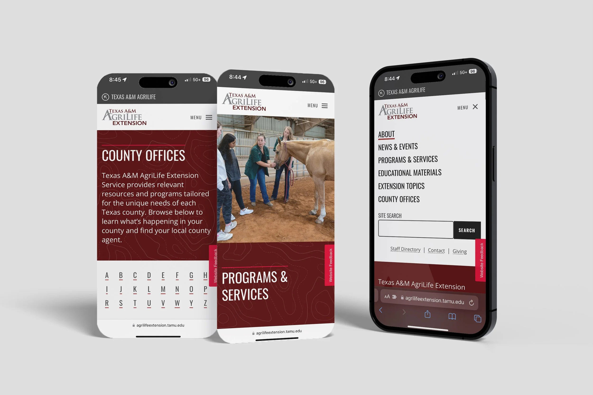
One of my significant accomplishments in UX/UI design was collaborating with the AgriLife Marketing and Communications Team to revamp the Texas A&M AgriLife Extension state website. This project involved consolidating 250 individual websites into a centralized hub, ensuring that users across Texas could easily access vital information.
Project Overview
Objective: Centralize and modernize the Texas A&M AgriLife Extension websites.
Tools: Figma for concept creation and prototyping.
Key Tasks:
Concept Development: Created the initial concept for the website, ensuring the Texas A&M brand was consistently represented. The goal was to respect the existing brand while modernizing the user interface and user experience.
Design Integration: Implemented topographic elements from print to web design, providing a cohesive experience for users familiar with AgriLife newsletters and print media.
Imagery Sourcing: Curated images from the AgriLife Repository to ensure visual consistency and relevance to the content, enhancing the overall aesthetic and usability.
Key Features and Improvements
Intuitive Navigation: Redesigned the navigation system to be user-friendly, allowing visitors to quickly find the information they need.
Visual Consistency: Maintained visual consistency across the site by integrating the Texas A&M brand elements and topographic designs.
Engaging Content Presentation: Developed visually appealing and informative content layouts that highlight key programs and services, such as the Texas 4-H Youth Development Program and Turfgrass Program.
Responsive Design: Ensured the website is fully responsive, providing an optimal experience on both desktop and mobile devices.
Accessibility: Focused on accessibility to make the site usable for individuals with disabilities, adhering to best practices in web design.
Highlights from the Redesign
Homepage: The redesigned homepage features a clean, modern look with prominent calls to action, a search function, and trending topics to guide users.
Browse by Topic: Users can explore various topics related to agriculture and life sciences, each section designed to be visually engaging and informative.
Program Highlights: Dedicated sections for key programs like Texas 4-H and the Turfgrass Program showcase their importance and impact, with easy access to related resources.
Events and News: The events and news sections are streamlined to keep users informed about the latest developments and opportunities in their area.
Impact
The redesigned Texas A&M AgriLife Extension website now offers a centralized, cohesive, and user-friendly experience that respects the institution's brand while providing easy access to essential information and resources. The modernized look and enhanced functionality have significantly improved user engagement and satisfaction.
This project showcases my ability to lead comprehensive UX/UI design projects, from initial concept through to final implementation, ensuring a seamless and engaging user experience.


